Satchel’s Pizza
Website redesign to improve customer reach for this Gainesville pizza spot
Website redesign to improve customer reach for this Gainesville pizza spot
Satchel’s Pizza
Modernizing a Gainesville Pizzeria
Due to competition from large pizza chains and a sole focus on providing a valuable dine-in experience, Satchel’s struggles to access a key customer base, college students. Given that Satchel’s is situated near one of the largest universities in the country by measure of student population, reaching college students would greatly increase revenue. The main goal of this Satchel’s website redesign is to cater to college students by streamlining ordering online, which will in turn bolster sales.
Overall, 13% of the U.S. population consumes pizza on any given day. For adults aged 20-39, 16% of men and 13% of women consume pizza on any given day (Rhodes et al., 2014).
College students prefer to use websites or apps from pizza chains because of their ease of use and their reliability. Satchel’s is unable to match its competitors because it lacks the in-house delivery infrastructure that those well-versed in online pizza ordering, such as college students, are used to.
54% of college students use food delivery services for fast foods, such as pizza, at least once a week. Many of these students don’t have consistent access to a car and live on campus, so the best way to reach them is by offering a delivery service.
The Need for Online Delivery
Problems
Difficulty ordering due to clunky outsourced delivery system
Lack of hierarchy for site navigation
Restaurant aesthetic not reflected in website branding
Proposed Solutions
In-house delivery system that meets industry standard
Hierarchy for site navigation that emphasizes important pages
Updating website branding to match the restaurant’s aesthetic
Research
Methods
To better understand the target demographic, I created a survey for current and former students at the University of Florida to complete. This survey was conducted to discern the primary reasons why college students would use the Satchel’s website and to verify that ordering delivery was indeed one of these reasons. After reflecting on the survey answers, I conducted user interviews to determine why users chose certain tasks as primary and to determine any pain points in using the current website.
Findings
Online ordering, checking the menu, and checking location are the three main uses
Most users have an interest in local events, especially music events
Delivery is used for convenience when the user is tired or busy
Existing website is very crowded
Constructing the Student’s Perspective
To further empathize with the user, I created an archetype of a University of Florida student. This student’s commitment to her coursework and other responsibilities, as well as inconsistent access to private transportation, like a friend’s car, often prevents her from going out to eat. This persona echoes the sentiments expressed by the users involved in my research by providing a realistic example of life as a college student. Both users familiar with Satchel’s and those not familiar agreed that the current website is frustrating to navigate and that this puts them off from wanting to use it to support the local business. With the creation of a persona, I developed a clearer understanding of the value of ordering online to college students.
Establishing Hierarchy
Satchel’s is a website with lots of moving parts. This site map helped me visualize all of these moving parts and condense them in accordance with my user research. Primary tasks, such as ordering online, checking the menu, locating the restaurant, and viewing events, received distinct pages. Some pages from the original site, such as merchandise and paintings, were consolidated. Less important pages would be relegated to the footer. Structuring the site in this encouraged users to order while reducing clutter.
Determining Optimal Paths
Generating user flows simplified the process of designing feature interactions, especially the feature of online ordering. My research showed that online ordering is the main way that the site would generate sales from college students, thus making it vital to focus on the online ordering flow. Linearizing ordering delivery allowed me to pick out points where friction must be introduced to decrease user stress further along in the ordering process.
Visualizing the User Experience
Rapidly producing wireframes granted me the ability to explore common design patterns for ordering delivery. Iterating the various delivery screens prevented me from fatiguing users with information by showing me how screens tend to get crowded when too much order information is repeated.
Reimagining the Satchel’s Brand
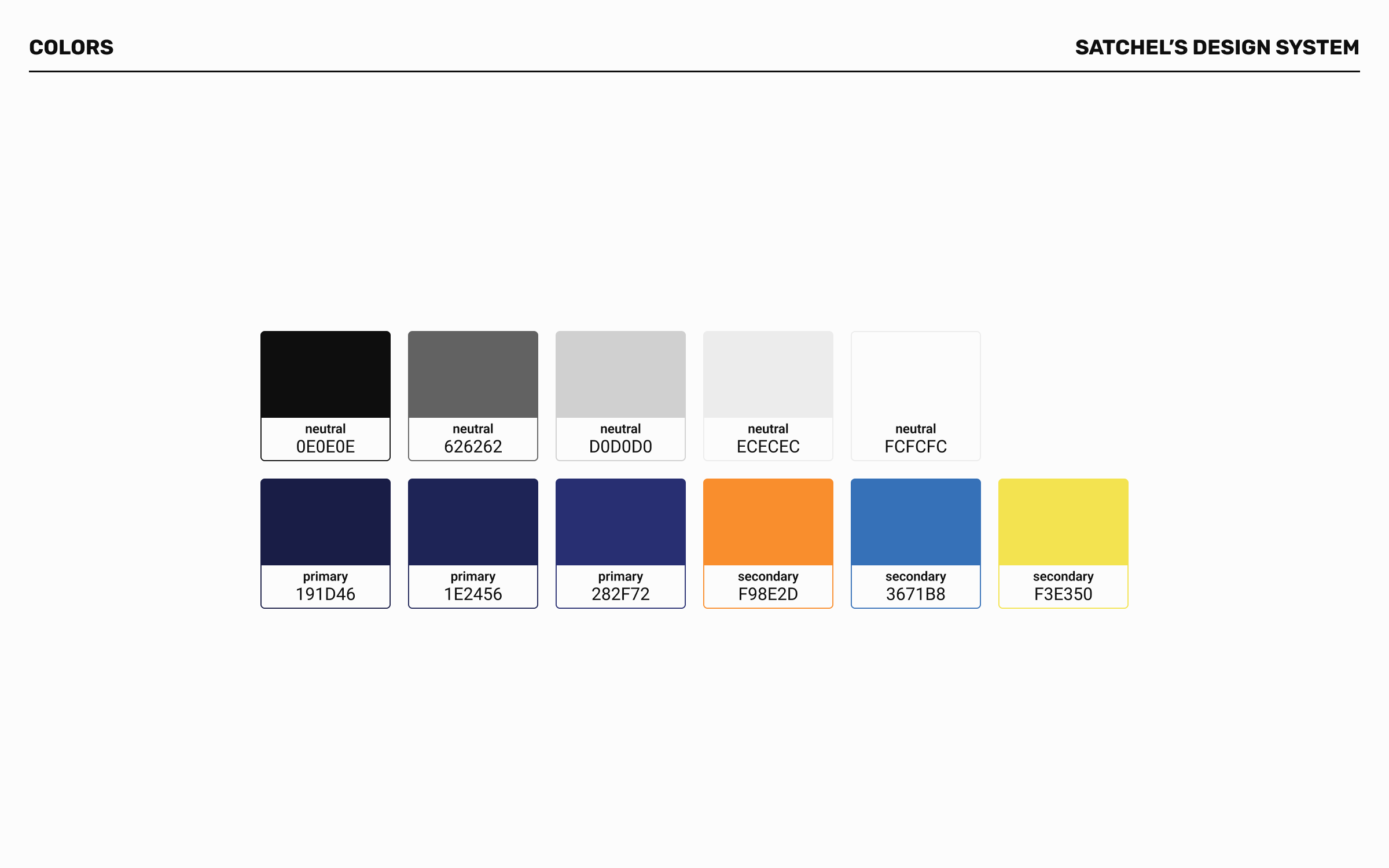
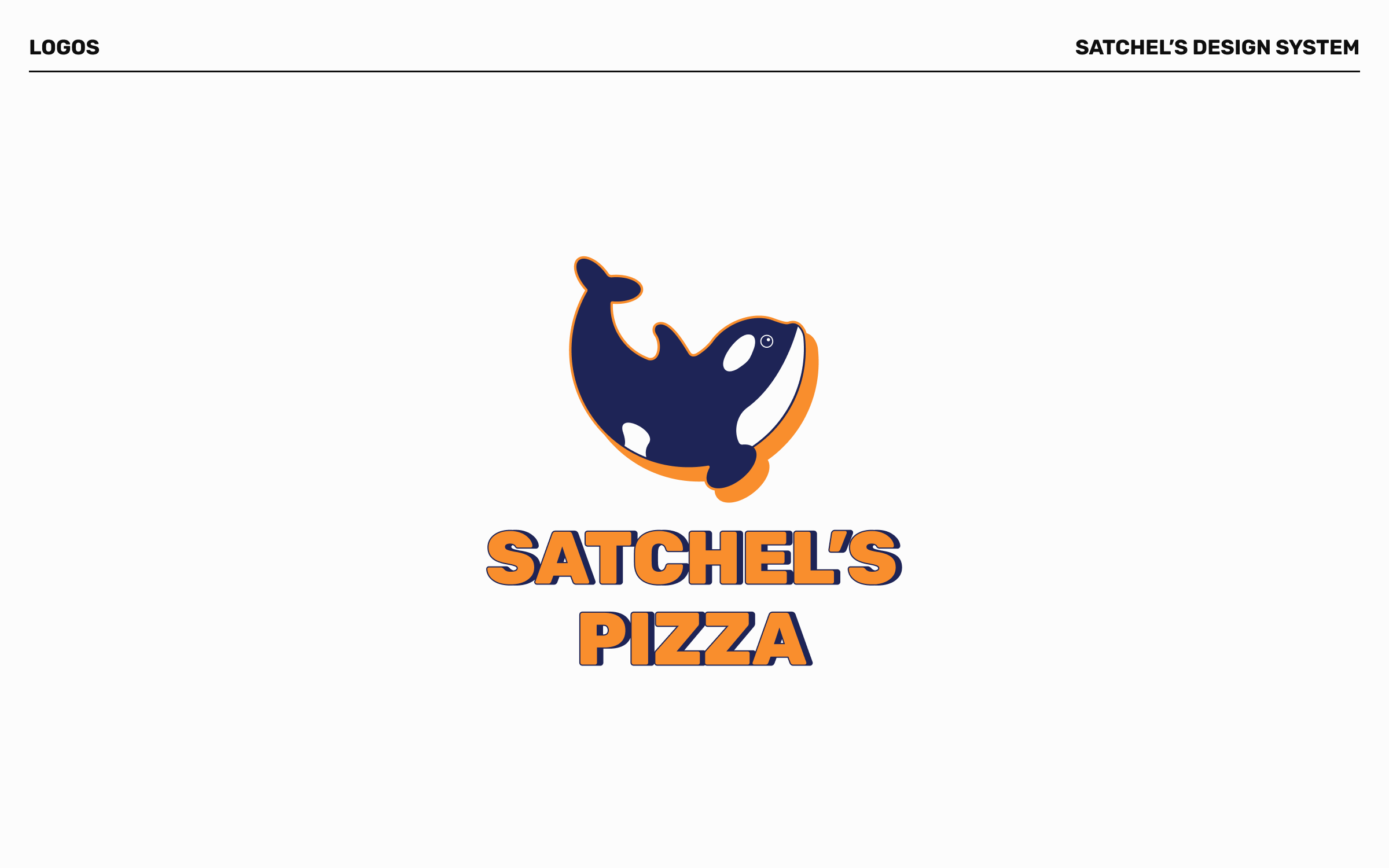
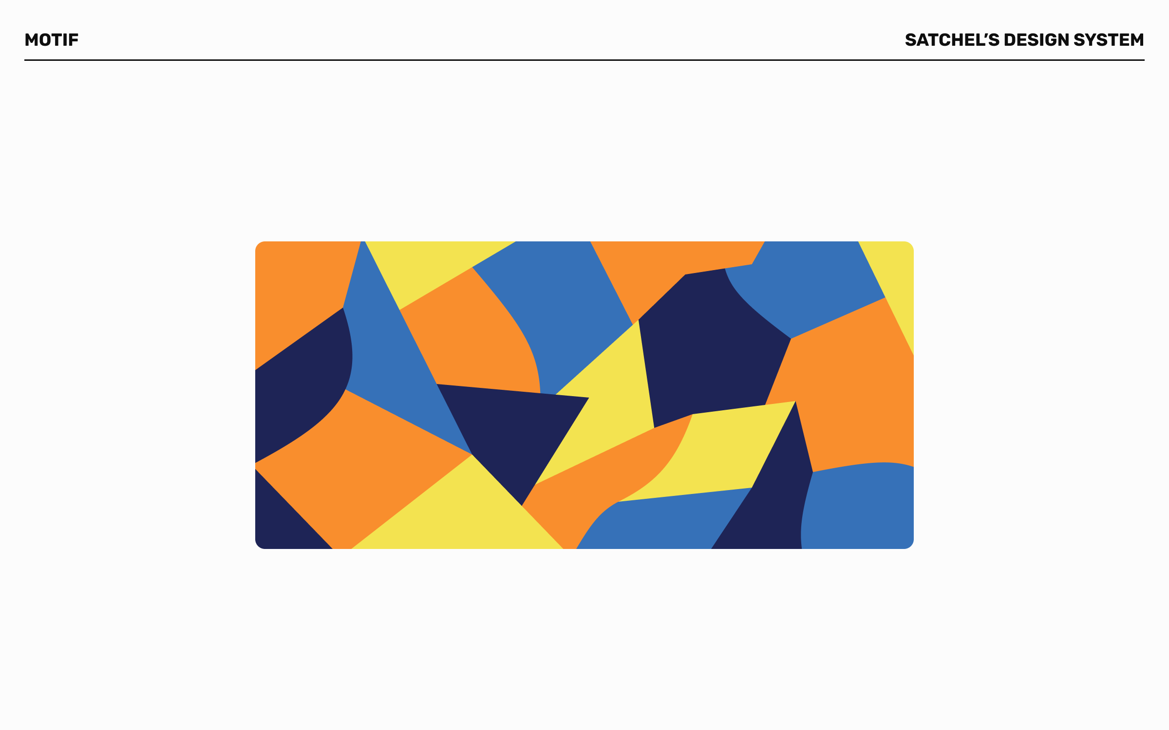
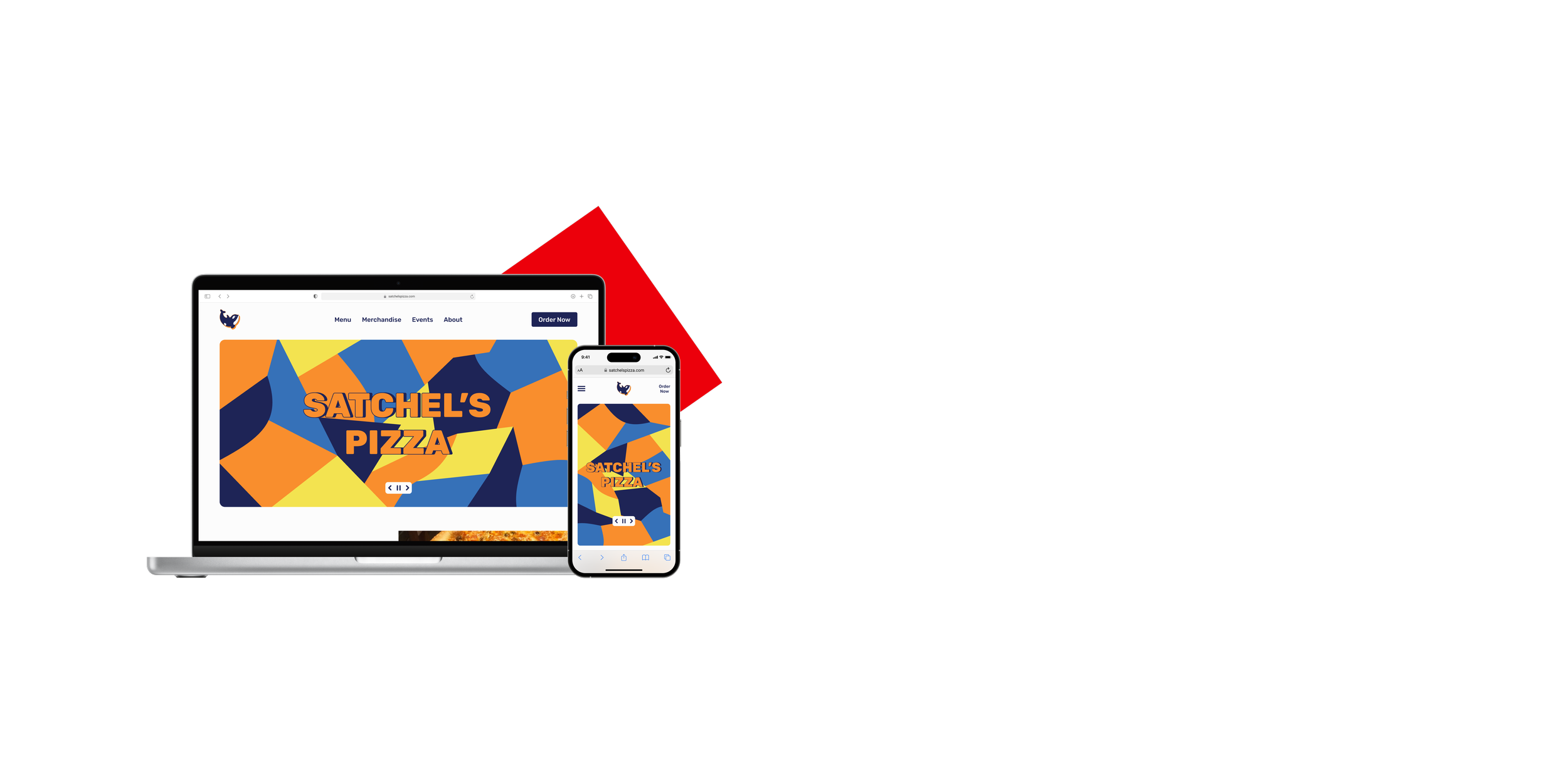
A significant drawback to the original Satchel’s website is the fact that the branding is so disjointed from the restaurant itself. To match the eclectic and artistic nature of the restaurant, I created a mosaic motif. This motif is used for several elements and mirrors the mosaic tiling present at the Satchel’s location. Bold orange and navy blue are used as the signature colors of the logo to keep some consistency with the original branding and to provide a nod to the University of Florida, which put Gainesville on the map and was attended by the owner of Satchel’s. The orca from the logo was updated to be more circular, as this shape is more organic and true to the real life animal, and subsequently a pizza pie as well.
Identifying Issues
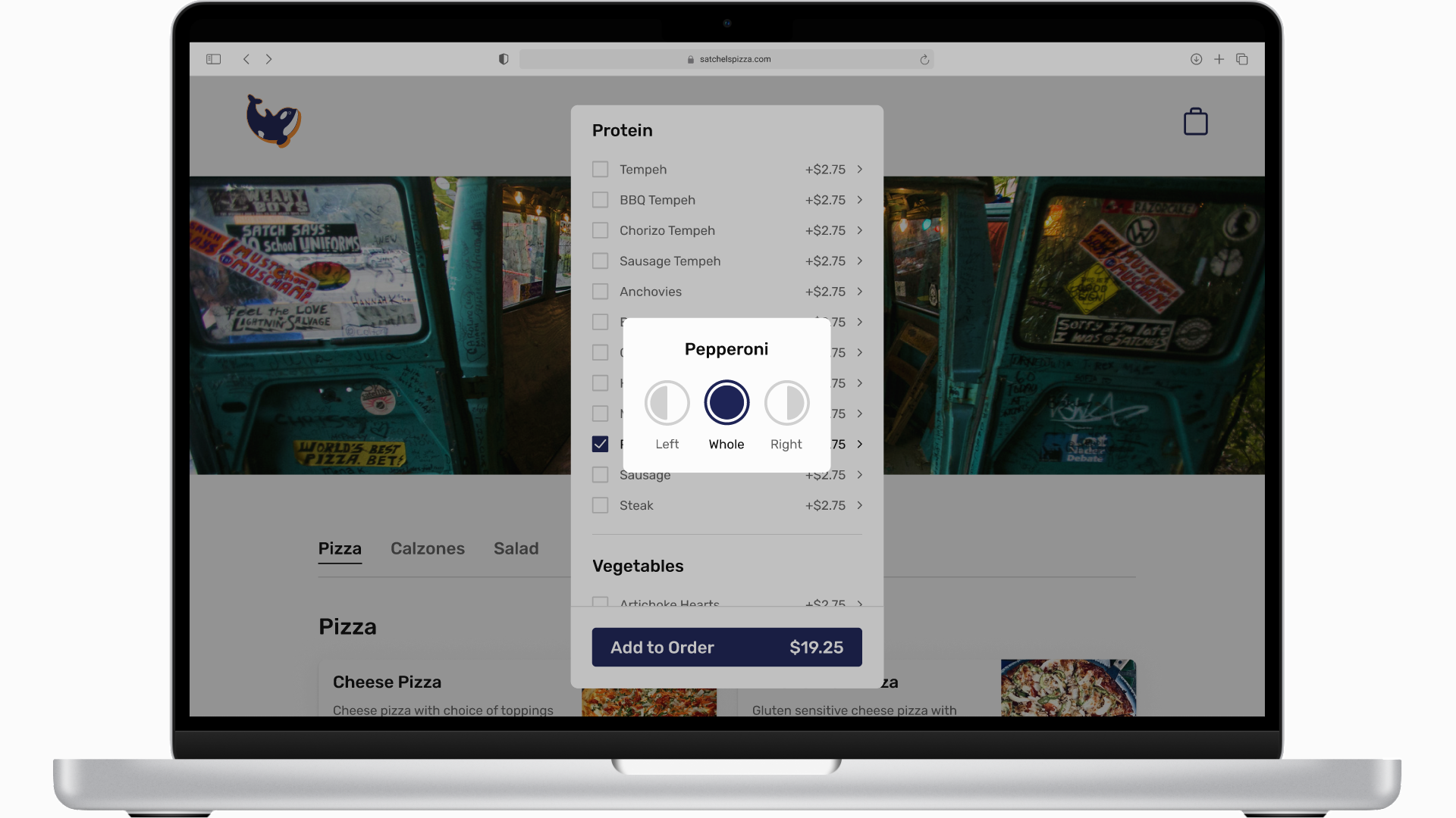
After pairing my wireframes with the components of the design system to create the first version of my high-fidelity prototype, I commenced user testing. All of the users were able to successfully complete the tasks given to them. Some users were hesitant to move forward during the topping selection part of the online ordering task. There was not enough friction introduced by the “choose topping side” overlay, which caused these users to be unsure if they chose the correct option. I replaced the overlay with a separate screen for choosing what side to put toppings on to introduce necessary friction.
The original topping selection overlay.
The updated topping selection screen.
Revealing the Outcome
Replacing the overlay with a separate screen proved to be a worthy solution. Users were more engaged in the process of adding an item to their order and they completed the tasks without any struggle. Below is a demonstration of the tasks within the Satchel’s website prototype.
Comparison
Satchel’s event sign up within the events calendar
Online order tracking that appears after completing order, which would be in addition to the text or email updates
Room for Improvement
The following improvements are features that would enhance the experience of users of the site. They are informed by my user survey and my user interviews.
Lessons Learned
I spent a lot of time trying to figure out how to modernize the menu in the style of larger chain restaurants, but this just led me to a dead end. For a small business like Satchel’s, that doesn’t have readily available nutritional information for their menu items and doesn’t come out with new items, it made no sense to try and replicate the experience customers have with viewing the menu of a chain.
When I started redesigning the Satchel’s website, I was under the impression that introducing friction through additional screens would inhibit the progression of tasks. After getting feedback on my designs, I came to understand that, paradoxically, friction can be necessary for task completion to run smoothly.


