Petter
Mobile app to help pet owners access comprehensive pet health information
Petter
Mobile app to help pet owners access comprehensive pet health information
A New Approach to Pet Health
There are hundreds of sources of pet health information available through websites and apps. Pet owners spend countless hours searching for information that is reputable and applies to their pet. Petter seeks to solve this issue through the creation of a platform that uses a pet’s background health information to form a feed of topics that cater to the pet’s needs.
According to large polls of over 1,000 pet owners conducted by the Associated Press (2009, 2010), 50% consider their pet to be “as much a part of the family as any other person in the household” (McConnell et al., 2011).
When a pet owner goes online to search for information to help their pet, they are bombarded with many different sources, all offering different viewpoints and solutions. In addition, pet owners struggle to access pet health information stored by their pet’s veterinarian, due to the limited online infrastructure that exists for many veterinary clinics.
78 percent of pet owners acquired pets during the pandemic and 66 percent of American households report that they own at least one pet. With the boom in pet ownership in the last few years, more and more people are looking to online resources to assist in taking care of their pet.
The Recent History of Pet Ownership
Problems
An overwhelming amount of surface level pet health information split across many different websites and apps
Limited access to veterinary visit information
Difficulty understanding available information
Proposed Solutions
Personalized articles based on individual pet needs
Provide quick access to pet’s entire medical record
Provide definitions to medical terminology in pet’s medical history
Findings
There are no direct competitors in the personalized pet health information space
Users want to access their pet’s medical files
Browsing online information is unreliable and time consuming
Limited access or no access to veterinary portal for making appointments
Pet priorities differ among users
Research
Methods
First, I conducted a competitive analysis to understand the methods that other apps use to tackle similar problems. Then, I conducted user interviews to inform myself of the variations in pet owner experiences and to better understand what my app needed to address and why.
Empathizing with Pet Owners
User interviews revealed to me that no two pet owners are exactly the same. Pet owners differ in how they raise their pets and what problems concern them the most as pet parents. However, several central pet care themes arose during my interviews. Pet owners want information to be plentiful and accurate. Forming a distinct persona allowed me to explore why the current system of pet health resources has failed the average consumer and how I can streamline the process so that users can enjoy learning about their pet instead of feeling overwhelmed.
Mapping Out Features
After prioritizing features informed by my user research, I created a site map. This site map gave me the opportunity to assess the ways in which pet owner’s will interact with the features. I organized the main features in a way that corresponded with the past, present, and future of a pet’s health. The past is represented by medical history, the present by home, and the future by appointments.
Navigating Important Tasks
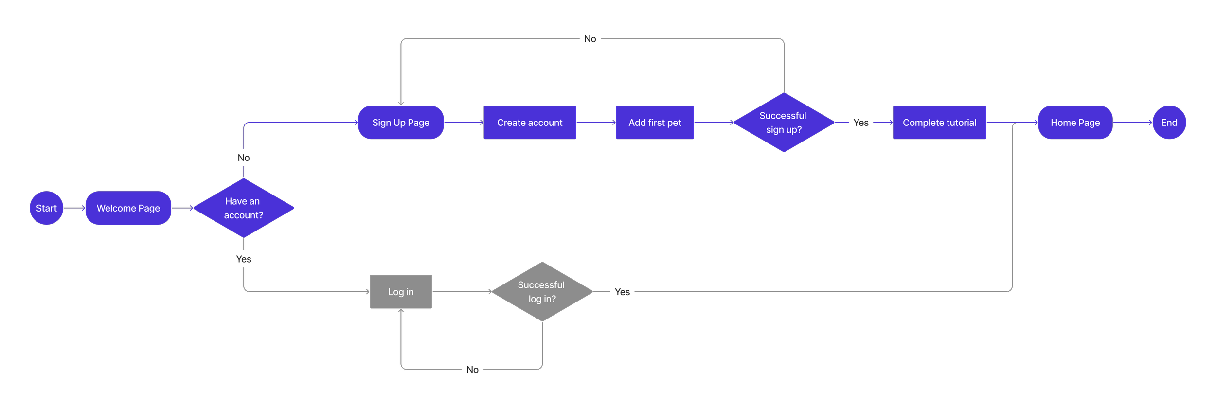
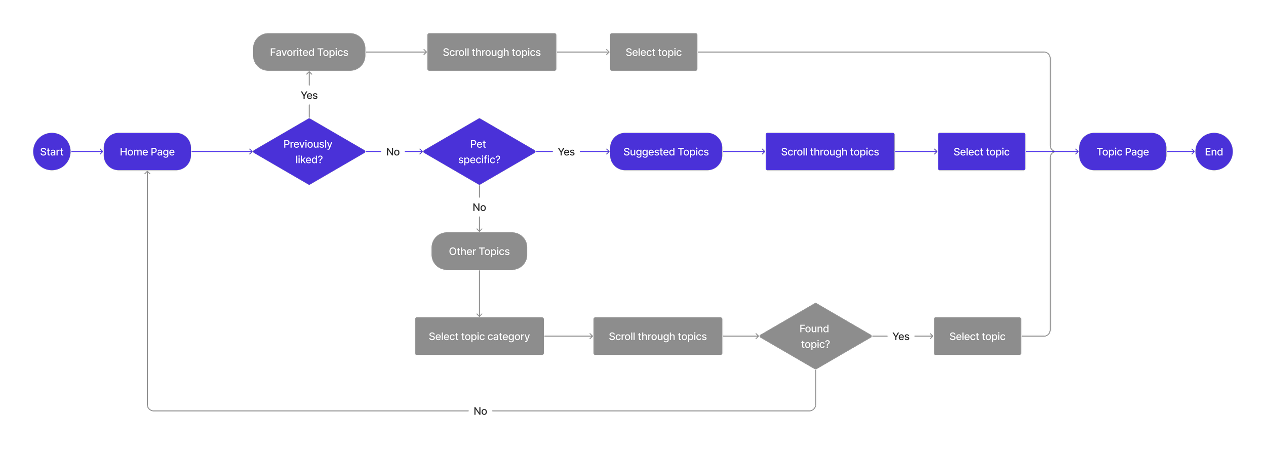
User flows were created to flesh out the feature interaction design. They allowed me to view interacting with the app through the linear lens that a user would. I was able to use the flows to determine the most efficient route for delivering pet health information to the user.
Exploring Design Patterns
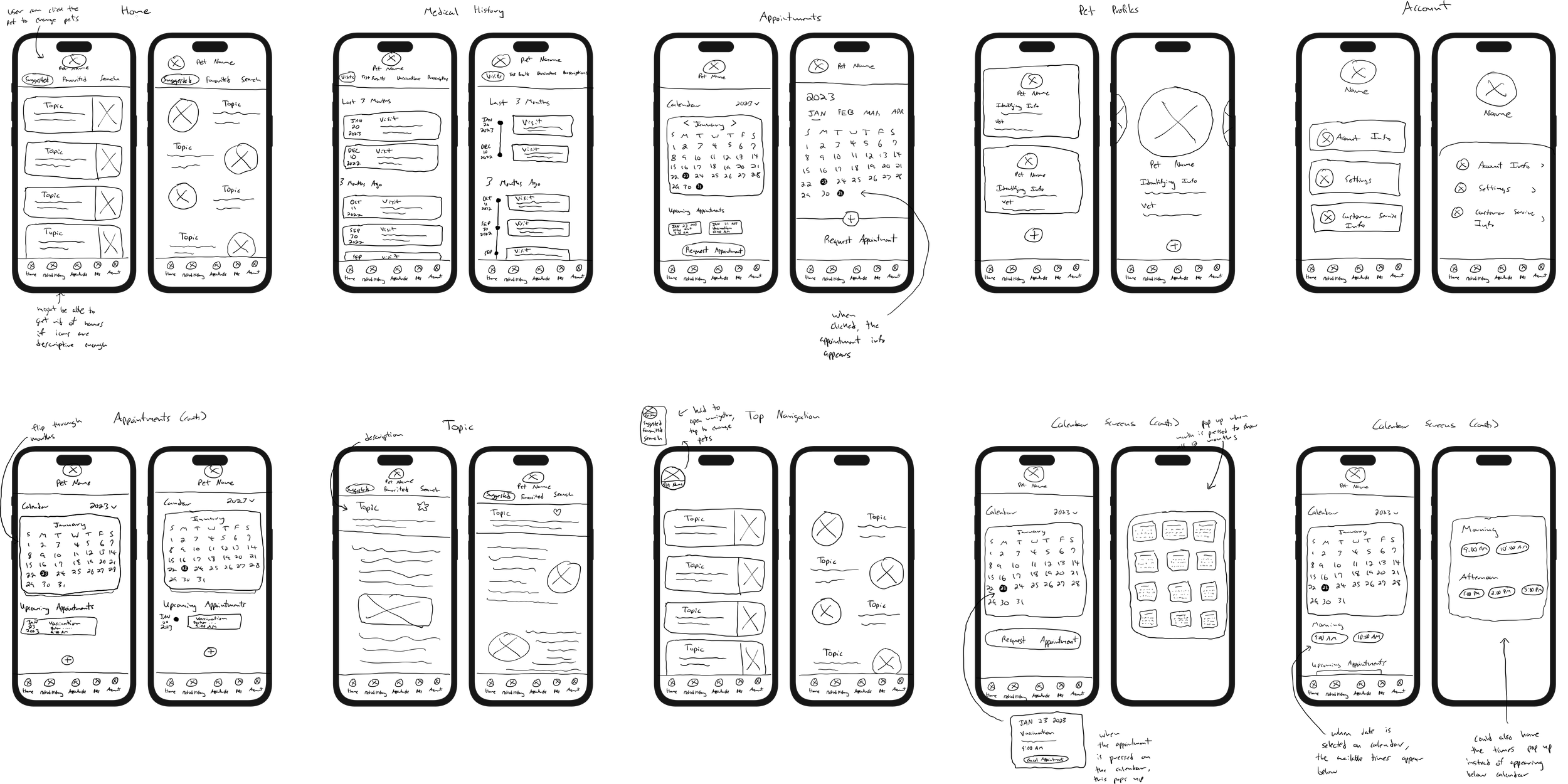
Sketching wireframes allowed me to investigate a plethora of design patterns, as well as many unique design choices. With wireframing, I discovered the optimal way to present pet health information.
Developing the Petter Aesthetic
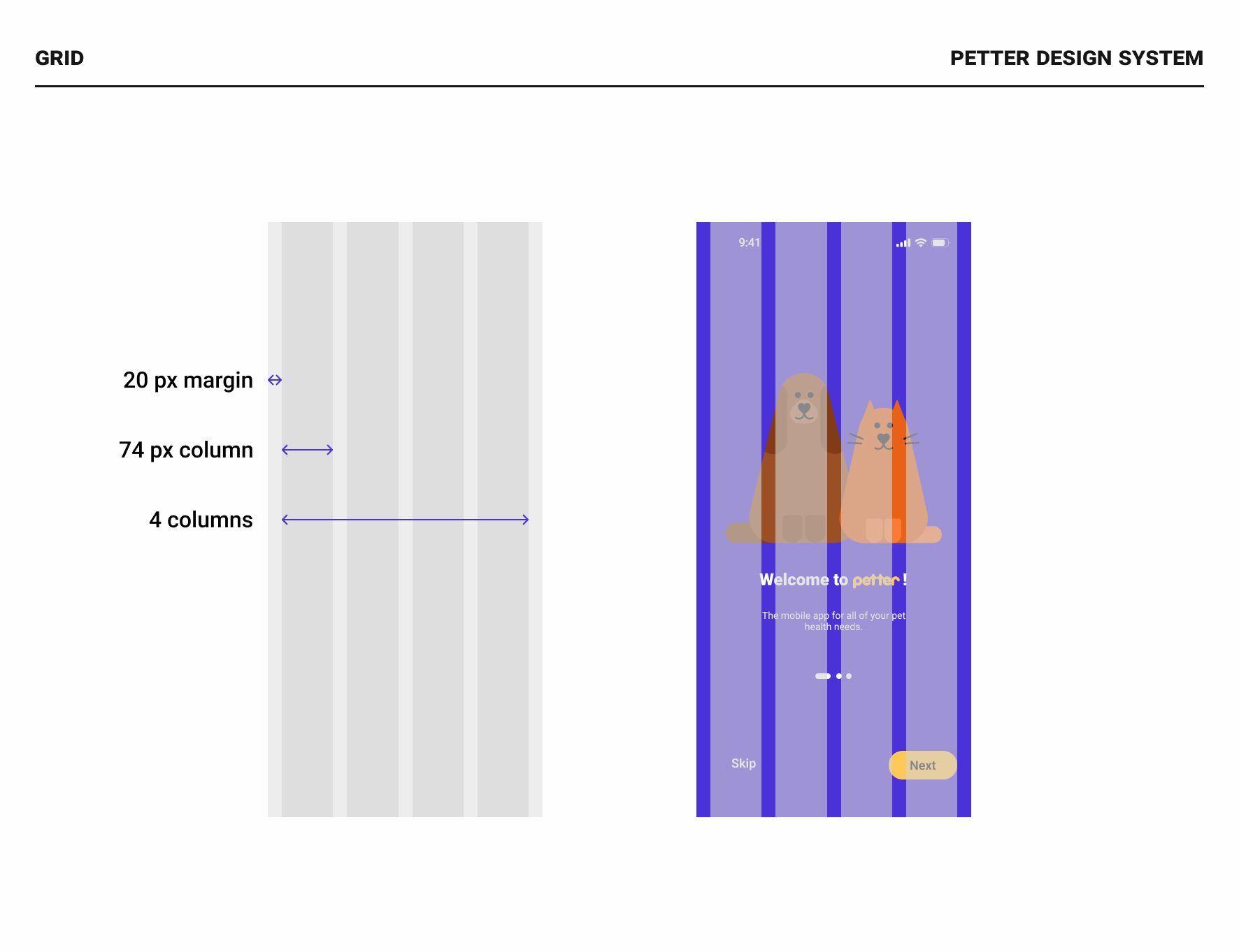
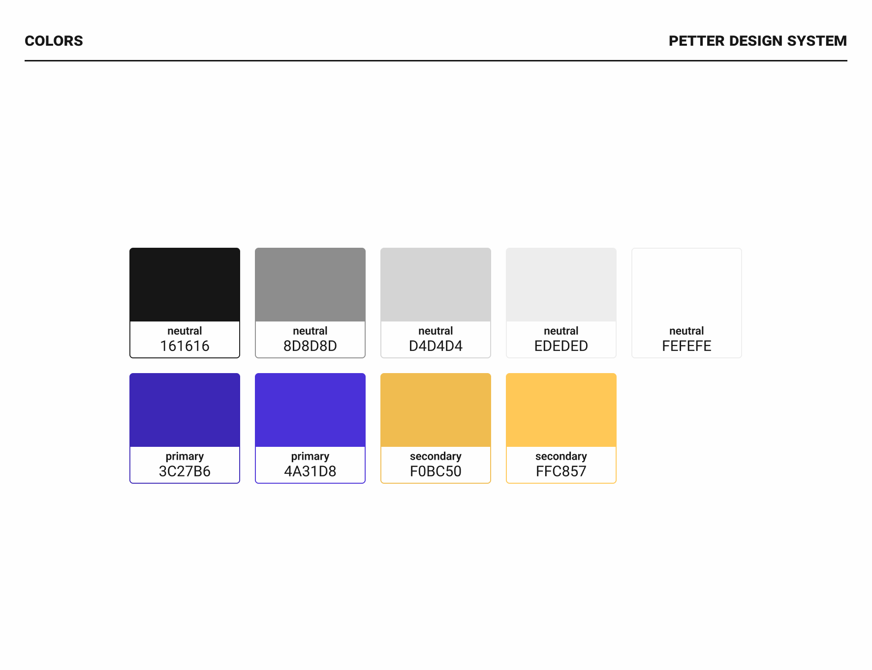
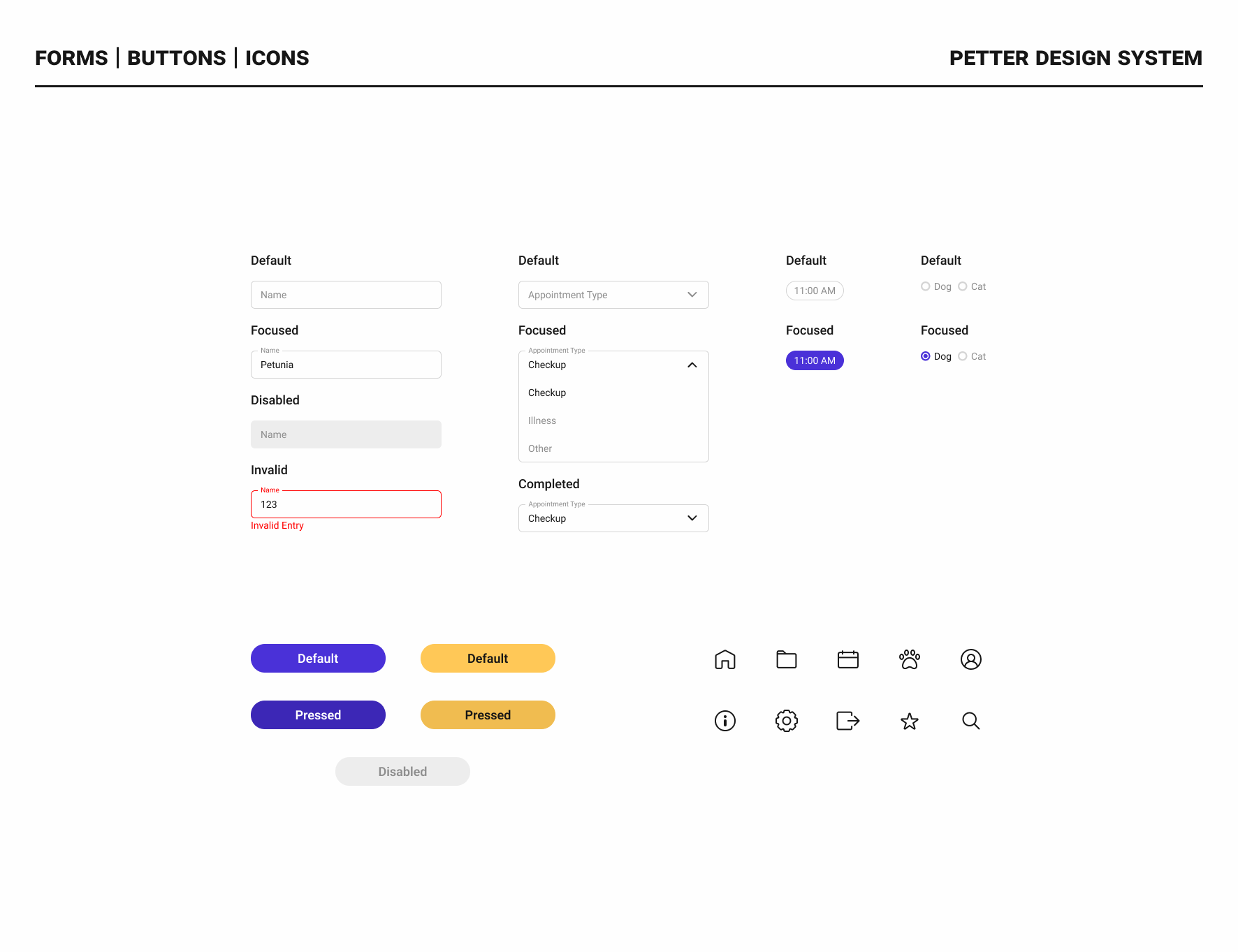
The following design system is a culmination of visual design choices that are both familiar to users and unique to the Petter brand. The hero color is a vivid purple and it is utilized throughout all of the app screens. It is complimented by the accent color, a bright yellow. These colors make the app feel friendly and playful, while still allowing the app to come across as clean and concise. Rounded buttons and forms further this duality. Illustrations were also drawn to complement the app’s ever present aesthetic.
Uncovering New Problems
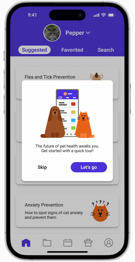
I took the designs from my mid-fidelity wireframing and elevated them by combining them with UI components that evoked the Petter brand. After I created my first high-fidelity prototype, I conducted usability testing. Although all of the users successfully completed the tasks, there were some hangups when it came to adding an additional pet and switching from one pet to another. Some users were not sure about the navigation steps necessary to complete these tasks. These users clicked other navigation icons out of habit or, in the case of switching pets, questioned where the navigation was. A short optional tutorial was created to instruct first time users of the app’s navigation.
Finalizing the Solution
With the addition of the tutorial, users gained an understanding of the icons and the unique interaction for pet switching. This allowed them to work seamlessly through all of the tasks. Below is a demonstration of the tasks within the Petter mobile app prototype.
Additional information for definitions of medical terminology, such as phonetic spellings and audio to hear the word spoken correctly
Appointment reminders and settings to adjust frequency of reminders
Information for pets that are not dogs/cats
Section within topic articles for list of sources
Potential for Growth
These improvements represent additions to the app that would allow it to compete successfully with other platforms. They are informed by the findings from my competitive analysis and my research.
Lessons Learned
When developing apps like Petter, more targeted interview questions are required. During the research phase, I struggled a bit with drawing the right information out of my interviewees because of the nature of my questions.
When developing the app, I sometimes became too caught up in the look and feel of the final result. I would envision the product before analyzing my research findings. Developing this app taught me how to refrain from jumping to the next step before fully processing the current step.


